Watercolour or Gouache for a Small Colour Study?
Watercolour or gouache for a small colour study? Choose the paint whose transparency, surface and layering suit the colour effect you want to examine.
You have a small sheet of watercolour paper, a limited palette and one colour relationship you want to understand. Watercolour or gouache for a small colour study? Choose by the way you want colour to sit on the page: watercolour lets the paper glow through, while gouache can cover it with a more solid, adjustable layer.
Neither medium is simply the easier version of the other. The useful question is what you want the study to reveal: a change in transparency, a clean block of colour, a soft transition, or the way one painted layer alters another.
What should the study let you see?
A colour study is a compact experiment in looking. It might isolate the warm shift in a grey cloud, compare the blue of a shadow with the blue of a distant hill, or test how a muted green changes beside a red-orange note. Keep the subject modest enough that you can attend to those relationships rather than spending the session on detail.
Watercolour is a natural fit when the paper’s brightness should take part in the image. A thin wash allows the surface to shine through, so a pale yellow or a diluted blue can feel luminous without being built from a dense coat of paint. Gouache suits a study where the colour itself needs a more even, opaque presence.
Decide what you want to notice before choosing the paint. If the question concerns light passing through a wash, choose watercolour; if it concerns the meeting of two solid areas, begin with gouache.
When does watercolour fit best?
Choose watercolour if your subject depends on transparency, staining edges or the visible movement of diluted pigment. The medium rewards a light touch: a wash can pool at a paper’s edge, feather into a damp area or leave a paler passage where the surface remains visible. Those variations can be useful evidence in a study, not blemishes to conceal.
It also fits a small study built from a few connected washes. For a coloured glass jar against a pale wall, for instance, you might want the glass to retain a translucent quality and the background to show through its tinted edges. Watercolour can help you compare those shifts without making every area equally solid.
Its transparency makes the order of marks matter. A light wash placed first can be altered by later colour, but a pale area is not as straightforward to restore once a darker passage covers it. Leave paper unpainted where its brightness is part of the plan, and keep a clean scrap nearby to check how a diluted mix looks on the same surface.
When is gouache the better choice?
Choose gouache when you want matte, opaque shapes, clear colour blocks or a study that can be revised by painting over a passage. Its body can make a pale colour sit over a darker underpainting, which is handy when comparing the edge of a light object against a coloured ground. That covering quality makes the painted shape, rather than the paper’s brightness, the main event.
Gouache also suits studies of simplified forms: a pear reduced to a light side, a middle tone and a shadow, or a row of coloured tiles. You can place adjacent shapes beside one another and judge their contrast directly. A brush with a pointed tip helps keep small edges legible, while a broader brush lays down a more unified patch.
Opaque paint offers room to revise, but it is not a plastic sheet. Fresh gouache can reactivate when a damp brush passes over it, so repeated scrubbing may disturb an earlier layer. Work with purposeful strokes, let passages settle, and avoid treating every small difference as something to repaint.
How do the surfaces and layers change the result?
Paper affects both mediums. Watercolour paper gives washes a textured surface and is made to handle wet paint; a smoother sheet can make small marks easier to control, while a more textured one may break a wash into visible flecks. Gouache can work on watercolour paper too, though a smoother surface may suit crisp, compact shapes.
For a small study, a manageable sheet is more useful than a cramped scrap. Leave a narrow margin around the painted area so your hand has space to rest and the colour field does not feel squeezed against the edge. If you are deciding between papers, make a small swatch on each rather than relying on how the dry sheets look.
Layering is where the mediums diverge most clearly. In watercolour, a new transparent wash often lets the earlier one remain visible, deepening or shifting it. In gouache, a thicker, opaque passage can cover what came before, although a thin layer may still show the underpainting. Neither result is automatically better; the right one depends on whether you want colour to accumulate visibly or replace an earlier decision.
Which paint fits your situation?
Use the effect you want to explore as the deciding factor. These situations can help make the choice concrete:
- You want a pale, light-filled study: choose watercolour, especially when unpainted paper can provide the brightest area.
- You want solid colour shapes: choose gouache for a more even, matte surface and stronger coverage.
- You want to compare transparent layers: choose watercolour, where each wash can alter the colour beneath while leaving it visible.
- You want to revise a dark shape with a lighter one: choose gouache, which can cover an earlier passage more readily.
- You want to study soft, flowing edges: choose watercolour and let dilution and dampness contribute to the transition.
- You want to compare crisp neighbouring colours: choose gouache and place distinct shapes side by side.
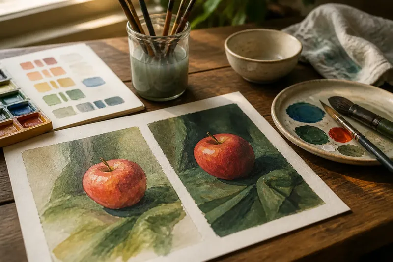
Imagine you are studying a red apple against a green cloth and want to compare the colour of its shadow with the cloth’s darkest fold. If you want the paper to glow through the apple’s warm light, begin with watercolour; if you want to adjust the apple’s silhouette over a coloured background, gouache is the more direct fit. In either case, keep the study focused on that colour comparison rather than adding detail that does not help you see it.
What if you have both paints?
You can use watercolour and gouache in one study, but a deliberate division of labour keeps the result readable. For example, transparent watercolour can establish a light ground, with gouache reserved for a small opaque accent. The contrast between the two surfaces then becomes part of what you are examining.
Try not to mix the paints simply because both are on the table. If every area switches between transparent and opaque without a reason, the study may stop clarifying its original question. Decide which passages should show the paper and which should cover it before you begin.
For one compact trial, divide a page into two panels. Paint the same simple object in each: use watercolour on one side and gouache on the other, keeping the palette and basic arrangement alike. The comparison makes differences in coverage, edge and layering easier to notice than two unrelated subjects would.
What do readers often ask about watercolour and gouache?
Can gouache be used with watercolour?
Yes. They can share a study, and watercolour is often useful for transparent passages while gouache supplies opaque accents. Keep the roles intentional so the contrast helps you examine the subject rather than distracting from it.
Can watercolour cover a mistake?
Watercolour can be lifted or softened in some circumstances, but it does not cover an earlier mark in the same way as opaque gouache. The result depends on the pigment and paper, so plan pale passages with care and make a swatch if you are unsure how a particular colour behaves.
Is gouache suitable for fine detail?
It can be, especially with a small pointed brush and a paint consistency that moves without flooding the paper. For a study, reserve fine marks for details that change how you read the colour relationship; a tiny outline can otherwise take attention away from the broader shapes.
Which should a beginner choose?
Choose the medium that matches the first effect you want to understand, rather than looking for one universal starting point. Watercolour teaches you to work with transparent washes and the paper’s brightness; gouache makes solid shapes and covering layers more accessible to explore.
How can you keep the study focused?
Limit the palette to a few colours and make a small mixing area before painting. A simple warm-cool pair, plus a neutral made from the colours you already have, is often enough to compare a subject’s light and shadow without turning the exercise into a catalogue of mixes.
Keep the scale small but leave room for a clear arrangement. A few broad shapes are easier to compare than a collection of tiny marks, and a clean margin helps separate the colour study from the surrounding table or sketchbook page. If you are using a sketchbook, place scrap paper underneath to protect the page below from moisture.
Let your first choice remain provisional. If a watercolour wash becomes more transparent than you intended, you can make a note and use gouache for a second study of the same colour question; if gouache feels too solid, dilute a passage or return to watercolour. The point is not to prove one medium superior, but to identify which material makes the colour behaviour you care about easiest to see. For a small colour study, start with the surface effect you want to examine, then let the paint follow that decision.