A Gallery Visit Built Around One Colour
A gallery visit built around one colour turns a casual circuit into focused looking, helping you spot how hue shifts mood, emphasis and relationships.
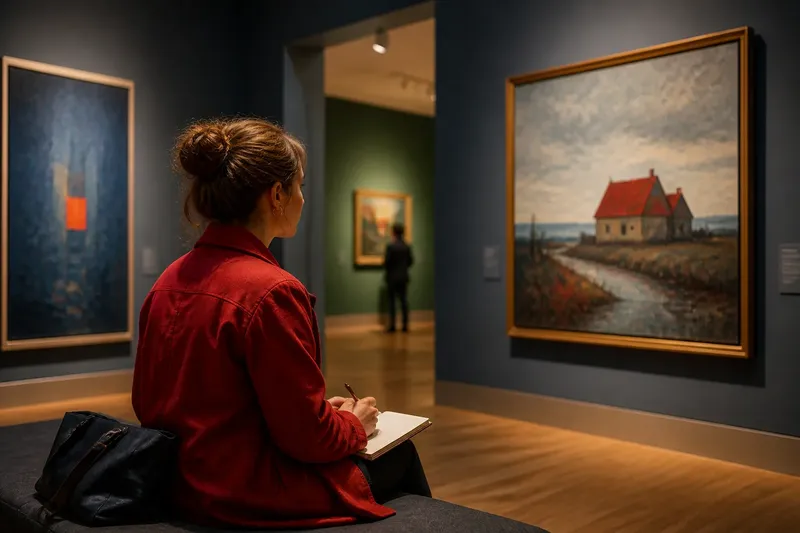
Choose a colour before you enter the gallery, and a red coat, blue shadow or green patch of wall can become a thread through rooms that otherwise seem unrelated. A gallery visit built around one colour is not a hunt for matching objects: it is a way to see how artists make the same hue feel tender, loud, distant or uneasy through its neighbours and its place in the image.
Give the exercise a morning or afternoon, rather than rushing through every room. You do not need to know colour theory; a pocket notebook, a pencil and a willingness to pause are enough. The useful question is not simply “Where is my colour?” but “What is it doing here?”
How should you choose the colour?
Pick a colour you can recognise quickly but do not already associate with only one mood. Blue might suggest calm to you, while orange might feel warm or insistent; that first impression is useful, but leave room for a painting to complicate it. A shade you meet often in clothes or everyday objects can be easier to track than an elusive tone.
Choose a broad family rather than a very exact shade. “Red” can include brick, rose, vermilion and a muted brown-red; “green” can reach from yellow-green to deep blue-green. Treat those variations as clues, not as reasons to disqualify a work.
Before going in, write down your first association in a few words. Keep it brief, such as “blue: cool and quiet”. You will have something to compare with what the gallery actually shows you.
What should you do before the first room?
Check the gallery’s visitor guidance, including any rules about photography, sketching or taking notes. If writing is allowed, keep your materials small and make sure you are not blocking other visitors. Plan a gentle pace: a short pause at the entrance can help you settle before the visual noise of a busy room takes over.
Walk through the first room without trying to record everything. Notice which works pull your eye, but do not decide yet that they are the “best” examples of your colour. A colour may appear as a tiny accent in one work and dominate another; both can reward a closer look.
Use a simple note format for each stop: work or room, where the colour appears, what it touches, and what effect you notice. A few words are enough. For instance: “green, narrow strip at edge, beside dull pink, makes the pink feel brighter.”
How can you follow the colour through a visit?
Spend the first part of the visit noticing presence and placement. Is your colour in the centre, at an edge, high in the image or close to the viewer? Does it occupy a broad area, or does it arrive as a small mark that changes how you read everything around it?
On the next pass, look at its neighbours. A yellow beside violet may seem sharper than the same yellow beside cream; a blue against black may feel deep, while blue against orange can seem more active. These are not fixed rules for every picture. Surface, light, shape and subject all contribute, so describe what you see rather than forcing a colour-wheel explanation.
Then look for repetition. Does the hue recur in several places, linking separate figures or objects? Does it appear once, like a sudden interruption? Notice whether a brushstroke looks dry or blended, whether a print gives the colour a crisp edge, or whether the surface catches light. The material changes the colour’s character.
Imagine you enter a room with a small landscape where red appears only in a roof. You might first read it as a bright focal point; after noticing a faint red-brown in the foreground, you may see the roof as part of a quieter rhythm rather than an isolated flash. Write down what changed in your reading and what visual detail prompted the shift.
What questions help you look more closely?
Does the colour make the subject stand out?
Check whether it draws your eye first or becomes noticeable only after you have looked elsewhere. Its size, contrast and position can make a modest patch command attention, while a large area may recede if its edges are soft or its tone is close to its surroundings.
What changes when the colour meets another hue?
Compare the colour with the patch directly beside it, then with a more distant colour in the same work. Ask whether the neighbour makes it seem warmer, cooler, brighter or less distinct. Record the visible relationship without assuming the artist intended a particular symbolic meaning.
Does the surface alter how the colour feels?
Look for clues in the mark: a translucent wash, a thick ridge of paint, a printed block or a smooth, flat area. The same hue can appear delicate or forceful depending on how it sits on the surface and how clearly its edges are defined.
Does the colour return elsewhere in the gallery?
Compare works without treating them as though they belong to one conversation. In one room, a repeated hue might make a composition feel connected; in another, it may isolate a figure or puncture a quiet arrangement. The contrast between those uses is part of the exercise.
How should you pace the morning or afternoon?
For the first stretch, follow your chosen colour loosely and note a few works that catch your eye. Take a short break before revisiting them; even a pause on a bench can refresh your attention. On the second pass, choose two or three works and spend longer with each, moving from the colour’s location to its neighbours, material and effect.
Near the end, look once more at the notes you made at the entrance. Has your first association held up, become more complicated or fallen away? Add one sentence about the strongest change in your view. Keep it tied to something observable: perhaps the hue felt less cheerful beside grey, or more commanding when repeated across a large canvas.
If the gallery is crowded, shorten the route instead of trying to hold your place in front of every work. A single painting seen with care can offer more than a hurried tally of colours. If a label gives useful information about material or process, read it after your first look so that the work has a chance to meet you visually before its description does.
What can you take away from the notes?
After the visit, group your observations by what the colour did: attracted attention, linked forms, altered a neighbouring hue, or changed with the surface. You may find that one colour had no single mood at all. Its effect depended on scale, placement and company.
Keep the notes as a small record of looking, not a verdict on the artists or a claim about what a work “means”. The next time you visit, choose a different colour and notice which habits of attention return. A gallery visit built around one colour can leave you with a practical question for any picture: what is this hue asking me to notice beside it?