The Quiet Work of Negative Space in a Drawing
Negative space in a drawing can clarify a crowded composition. Learn to read the gaps, balance forms and decide where the eye should pause.
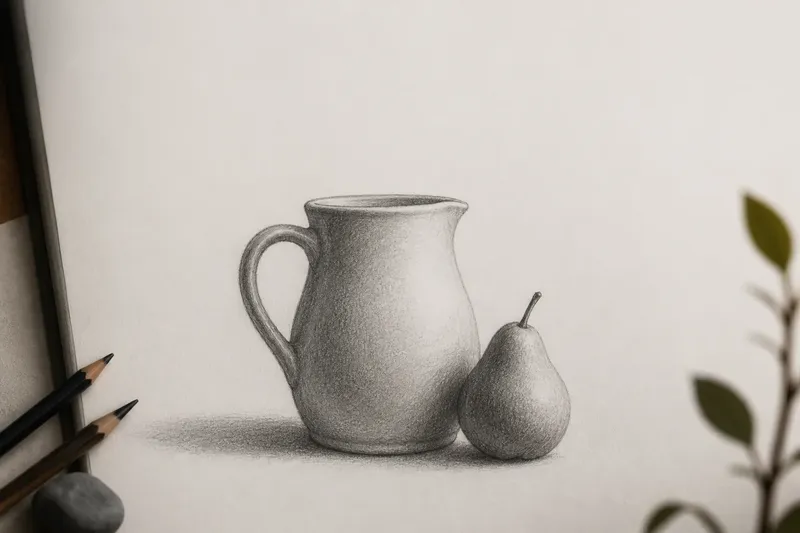
Negative space in a drawing is the unmarked paper between and around its forms, and it can decide whether a composition feels crowded or clear. Imagine you are drawing a ceramic jug beside a pear: the shapes matter, but so do the wedge between them, the opening in the jug’s handle and the margin left above the rim.
Those spaces are not empty in the sense of being irrelevant. They have edges, widths and directions, just like the objects that define them. Read them as shapes and they can help you steer attention without adding another line or detail.
What is the negative space doing?
In a drawing, positive space is occupied by the things you depict; negative space is the ground around or within those things. The distinction is useful, but it is not a hard border between important and unimportant. The two kinds of space depend on one another: alter a contour and the adjacent gap changes with it.
That relationship becomes easiest to see where shapes nearly meet. A narrow gap between a bent arm and a torso, for instance, may be more distinctive than either shape considered alone. If the gap closes, the two forms fuse; if it widens, they separate and the pose may feel different.
Try looking at the outline of a familiar object, then shift your gaze to the patch of paper just outside it. The boundary still describes the object, but your attention has moved from naming the thing to noticing its angles and curves. That shift can interrupt the habit of drawing what you think an object looks like instead of what its edges actually do.
How can a gap guide the eye?
The eye often follows changes in direction, contrast and spacing. A pointed opening can lead towards another form; a broad, quiet area can give the eye somewhere to rest before it moves on. These effects are subtle. A gap does not need to look like an arrow to guide a viewer.
Consider a cluster of three leaves. If their edges overlap in a tangled knot, the eye may stall there. A small, clean wedge of paper between two leaves can separate their contours and make the arrangement easier to read. Leave a larger open patch beyond the cluster, and the eye has room to move back into the composition.
Negative space also sets a drawing’s visual pace. Repeated narrow gaps can make forms feel compressed or rhythmic; a sudden wider interval can slow that rhythm. Look for these changes rather than assuming that every opening should be equal.
Can the spaces balance the forms?
Balance does not require matching shapes on either side of a page. It comes from how visual weight is distributed, and unmarked areas affect that weight. A dark, dense group of lines may feel heavier than a broad pale region, but the pale region can still counter it if its shape and position hold attention.
In the imagined jug-and-pear drawing, say the pear sits close to the jug’s lower right side and the composition feels lopsided. Rather than adding a decorative object on the left, you could reconsider the open space above the jug: perhaps the top margin is too tight while the left margin is generous. Adjusting the placement of the two objects on a fresh sheet could make the surrounding spaces feel more deliberate, with the pear no longer pressing against the edge of the page. The expected observable result is a clearer separation between the objects and a more settled arrangement, not a magically symmetrical one.
That distinction matters. A drawing can be intentionally uneven and still feel balanced. Negative space helps you judge whether the imbalance looks purposeful or merely accidental.
How do you check the gaps while drawing?
Use a simple sequence of observations, returning to the page as a whole rather than polishing one small area for too long:
- Mark the outer limits of the composition lightly, then check whether the surrounding margins feel cramped, open or uneven.
- Identify the largest unmarked shape and compare its width and direction with the main forms beside it.
- Look for narrow openings between forms, especially where contours almost touch or cross.
- Compare similar gaps. If two openings seem intended to echo one another, check whether their angles and widths actually support that reading.
- Squint or step back to soften small details, then notice which open areas still register clearly.
- Turn the drawing sideways or view it in a mirror to make familiar objects less distracting; check whether the overall arrangement still holds together.
These are checks, not rules. If an awkward-looking gap suits the subject’s tension or movement, it may be doing useful work. The question is whether you meant to keep it.
What changes when you draw the space instead?
One practical exercise is to describe an opening before drawing the object that surrounds it. For the jug’s handle, attend to the hole inside it: its contour, its tilt and the way its edges taper towards the attachment points. Then draw the handle as the material around that opening. The outer shape is often easier to judge once the interior gap has a clear form.
You can apply the same approach to the spaces between separate objects. Lightly mark a gap’s corners or its broadest point, then compare those landmarks with the objects’ contours. Keep the marks faint enough to revise; they are guides to shape, not a new outline that must be obeyed.
For a more graphic drawing, you might shade some negative spaces rather than leaving them white. A soft graphite tone behind a pale object can make its edge easier to read, while untouched paper elsewhere preserves contrast. Keep the value changes in service of the spatial relationship: shading every gap equally can flatten the difference between a close, pinched opening and a broad interval.
Which questions help you judge negative space in a drawing?
Should every gap be the same size?
No. Varied openings help communicate distance, overlap and movement. Repeating a similar gap can create rhythm, but uniform spacing may make unrelated forms look mechanically arranged.
What if the negative space looks like an object?
That can be useful. A gap may resemble a wedge, crescent or narrow column, giving you a familiar shape to compare against. Treat the resemblance as a way to observe its outline, not as evidence that the gap needs extra detail.
How do I tell whether a margin is too large?
Check what it does in relation to the composition, rather than judging it by size alone. If the open margin pulls attention away from the subject or makes the placement feel accidental, revise the object positions or the crop on a separate sketch.
Can negative space matter in a detailed drawing?
Yes. Fine detail may enrich a subject, but its larger spaces still organise the page. Pause occasionally to check whether new marks have crowded an opening that previously kept two forms distinct.
When should you leave the space alone?
Once the relationships read clearly, resist filling every quiet patch with texture, hatching or a more emphatic contour. A blank area can make a busy section feel intentional, and its restraint can be as expressive as the marks around it. If the drawing feels unresolved, first check whether a contour or spacing relationship is unclear rather than decorating the gap.
Return to the imagined jug and pear at the end of the session. The useful question is not simply whether the objects look convincing; it is whether the spaces between them, inside the handle and around the page support the way you want the eye to travel. Negative space in a drawing is most effective when you can recognise its shape, feel its effect and still let it remain quiet.